

Design Collaboration App
Company: Sony PlayStation • Project Length: 1 month • Role: Lead UX Designer
As part of the Design Systems team, I worked on an application which supports the product development process at PlayStation. Users of the application were employees at PlayStation, and the purpose of the application was to aid collaboration between cross-functional teams such as Design, Engineering and QA teams mainly in Japan and the US.
Project Outcome
Designed and delivered the new user onboarding experience, and also a guided experience to introduce new features and help drive adoption along the user journey. I worked closely with my team to help prioritize designs for development sprints.
Design Problems
The user onboarding was ineffective because there was no in-product guidance other than a link to a user guide website. As a result, a live training class was required which was time consuming and not scalable. Also, there was lack of feature adoption because there was no effective way to communicate the new features other than through emails.
Subsequently, users could not derive the full benefits of the product, and they were constantly reaching out to my product team for questions and guidance on how to use the product.

Onboarding user experience prior to my design. It lacks information like the purpose of the application and guidance for what users can do next. It is also filled with pre-populated data which would be confusing for first-time users without explanation.
User Research
After hearing from my team about the design problems, I wanted to investigate users’ needs, motivation and behaviors focusing on the design problems. I conducted user interviews after recruiting five users who had joined the company within the past six months. From the interviews, these were the trends that surfaced.
Most participants did not understand the purpose of the application when looking at it
Most participants did not learn about the application on their own by reading the user guide
No participant had read emails about new feature releases
In addition to that, there were a couple of more findings that were worth communicating to my team. First, a participant needed help on a task because the application had usability issues related to discoverability. The participant did not know where to get help so reached out for a help by direct messaging a developer on my team. Second, there was a negative emotional reaction associated with the existing onboarding experience. One participant expressed frustration and resentment towards the company — “I did not expect this kind of onboarding from a multinational corporation.”
By interviewing users, I was able to connect the dots between design problems and user behaviors.
Project Goals and Design Constraints
Before diving into creating solutions, I wrote down goals and constraints for this project and shared them with my team so that we were aligned. The goals were:
Increase user awareness and adoption of new features
Onboard new users effectively and efficiently
Improve usability and make product help more accessible
The design constraints were:
Deliver short term solutions that were quick to implement, measure success and iterate on the design
Design reusable components to account for the product’s future
Use UI components from the design systems library
User Journey Map and Mind Map
Next, I facilitated a white boarding session with my team while drawing the user journey map and mind map. The purpose of this session was to share the user research findings and brainstorm high-level design ideas. During this time, we came up with some ideas to implement on the application as well as change management oriented ideas which involved our upper-management stakeholders.

A picture of the whiteboarding session showing the user journey map and the mind map.
User Stories
I put together user stories so that I could help get my development team ready for the next sprint as well as keep my design and product teams in sync for what we want to deliver to the users. Below are the user stories.
As a user, I need to know about new features and workflow changes so that I can minimize my learning curve
As a new user, I need to know how to perform my main tasks so that I can correctly follow the product development process at PlayStation
As a user, I need access to the information about the application so that I can learn and trouble shoot on my own
Finding Inspirations
I looked around the web for some inspirations, and I identified a few common design patterns in the market. I often do this kind of research as it helps with what users today expect from a well designed application. I looked at the wide range of user onboarding strategies in mobile apps, gaming industry and enterprise applications.

I documented design patterns found around the web to gather some inspirations and reference them later.
Ideation Phase
After the research, the direction I wanted to take became clear. I decided to create an experience that personalizes the onboarding experience, provides contextual instructions and maximizes the empty (the beginning) screen. Also, I was interested in interjecting elements to trigger positive emotions to encourage our users with learning and interacting with the application.
One of my sketches where I focused on creating as many ideas as possible.
Constraints on Personalized User Onboarding
At this point, I needed to clarify with my team if there were any challenges regarding creating a personalized user onboarding experience. During my research phase, I found personalized user onboarding design pattern popular in applications like Pinterest, QuickBooks and InVision. They collect user information on the first screen by asking questions like “What is your role?” or “Why are you here?” The design pattern appeared to be appropriate for our case because each role got different main tasks to perform at PlayStation. For example, a user with designer role uploads a design document on the application. On the other hand, developer and product manager roles consume the uploaded design document and hardly ever upload any kind of document on their own.
Therefore instead of asking users about their roles, I thought it will be more efficient to automate the data collection since the information about the roles was already provided when users requested access to the application. So I proposed that the system checks for the role and provides a personalized onboarding experience based on it (as shown in the diagram below). Due to time constraints, this personalized experience was slated for a future release.

Design Iterations
The next phase in my design process was to start creating low-fidelity wireframes. As I got feedback from my team, I made a few iterations. Below is an example of how my wireframes evolved from low to high-fidelity.

This demonstrates how the welcome modal dialogue design has evolved. I focus on speed for low-fidelity screens in order to get my team’s feedback quickly. For high-fidelity screens, I pay attention to details and make them pixel perfect.
Final Solutions
Below are the final solutions I delivered to my team.
User onboarding
This flow is designed to give a gradual introduction to the application. It moves from communicating the purpose and the value of the application to an overview of the UI, and it ends on the improved homepage where additional learning materials are available. I designed the experience so first-time users feel welcome and supported.


announcing new features
When users log in and new features are available, my design highlights them through two types of design patterns, Focused Tip and Modal Dialog.
Focused Tip — It is light-weight and contextual and helps make users aware of new features at a glance.

Examples of the focused tip design pattern.
Modal Dialog — This design pattern is used for announcing more complex new features and features which may impact users’ current work flows. It can include an image or animated gif of a new feature to help users understand the feature at a glance. Also I incorporated progressive disclosure with a short summary about the new feature and provide a hyperlink, which provides users mechanism to learn more. This helps reduce complexity and learning curve. To ensure the users do not miss out on important information, I designed the modal dialog to be persistent. It appears every time users launch the application until they explicitly click on “Do Not Show Me Again” button.

An example of the modal dialog design pattern.
What’s New Section
This design uses a drawer UI component to provide new feature announcements and to make them available anytime. I designed this while considering scannability and progressive disclosure to reduce complexity. This design is helpful when users mistakenly dismiss modal dialogs or focused tool-tips or need a refresher about a new feature that they are not yet comfortable with.

Clickable Tutorials
This design is to help users get familiar with new features which have steep learning curves (e.g. features involving many steps). It is contextual and reinforces learning by doing.

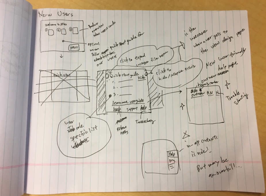
User Guide
While it was outside of the immediate scope for the effort, I also made proposals for evolving the user guide so it would better support the new experience. I recommended the user guide be adapted with the user journey in mind and the content be organized based on users’ needs. Specifically, I recommended the following to help improve navigability and information architecture, thereby reducing cognitive load on users.
1. Create an overview area which quickly summarize our application’s purpose
2. Create task based how-tos for each user role with short videos, gifs, images or step-by-step guides
3. Create areas for FAQs and Troubleshooting where users can look up common issues and workarounds
4. Create an area where users can read about recent feature releases and bug fixes

A screenshot of the user guide. As seen here, there were problems with navigability and information architecture.
Below is the final experience shown in a gif.
